Website Redesign for a Community-Focused NYC Clinic
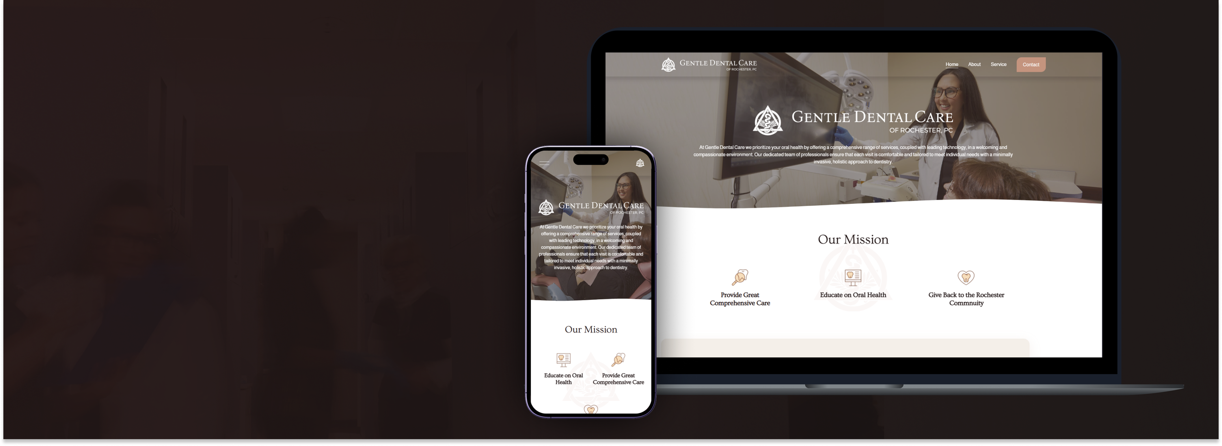
A full website redesign for Rochester Dental, a neighborhood dental clinic in New York City, focused on enhancing patient trust and usability across all devices. The project aimed to modernize the clinic’s digital presence with a clean, accessible interface that allows users to explore services, meet the care team, and book appointments with confidence. The design incorporates responsive layouts, real-time feedback cues, and SEO optimization to ensure both user engagement and discoverability.
#Web #Responsive #Desktop #Mobile #Figma #Framer #B2C #UIUX
Overview
Background
This project started with a clear need: citizens didn’t have enough direct channels to participate in public decision-making. Most deliberations were happening behind closed doors, and even when opinions were collected, people rarely saw real impact.
We wanted to change that.
The goal wasn’t just to create a space for discussions—but to build a structured, trustworthy system where citizens could actively propose, discuss, and vote on issues that affect society. We also wanted those discussions to lead somewhere—to influence laws, policies, or institutional changes in a traceable, public way. In short, this platform was about making public voices count.
My role
As the lead product designer, I was responsible for designing the entire experience—from structure and flow to visual design and interaction.
I mapped out a step-by-step user journey across six major phases:
Introduction → Learning → Discussion → Opinion Sharing → Consensus → Results.
Each step required specific tools—like file upload, surveys, Q&A, group meetings, and voting modules. I created a modular design system that supported those interactions, while also ensuring a consistent experience across desktop and mobile.
I also emphasized accessibility, transparency, and visual clarity—so that even first-time users could navigate the platform with confidence.
Goal
The main goal of this platform was to close the gap between ordinary citizens and the institutions that shape their lives. We didn’t want people to feel like passive observers—we wanted them to truly believe that their participation could lead to real, meaningful change.
To make that possible, the platform had to offer a process that felt approachable and easy to follow. Whether someone was participating as an individual or part of a group, whether they preferred to engage anonymously or publicly, the system needed to support those choices. It was also important that people could see where they were in the process at any given time—tracking progress transparently and feeling a sense of movement and impact.
Most importantly, the results of participation couldn’t just live in the system. They had to be exportable, reportable, and capable of being transformed into official proposals or feedback that could be shared with institutions. This wasn’t just a product—it was designed as a civic tool to turn voices into influence.
Implementation Highlights
OBJECTIVE
To create a digital platform that empowers citizens to actively participate in public decision-making — from proposing ideas to voting — in a structured, transparent, and traceable way. The platform aims to bridge the gap between the public and institutions by transforming civic input into real social, legal, or policy impact.
Research
CHALLENGE
Public deliberation in Korea and globally often suffers from low participation, lack of transparency, and little tangible outcome. Citizens may leave comments or attend town halls, but rarely see how their input changes anything. The problem is not just engagement — it's trust.
Moreover, designing for deliberation means addressing different personas (admins, facilitators, citizens, experts), different methods (surveys, meetings, Q&As, voting), and a wide range of contexts (local policy, government feedback, educational use). It had to be a highly flexible yet simple-to-use system.
| Platform | Country | Strengths | Weaknesses | UX Implications |
|---|---|---|---|---|
| Purpoz | France | Guided proposal and voting flow, clean UI, civic onboarding | Rigid structure for complex deliberation, low transparency in outcome delivery | Customizable workflows and clear traceability from idea to policy needed |
| Parti | South Korea | Emphasis on democratic process, strong framework for citizen organizing | Overly conceptual, lacks scalable admin features and polished interaction | Balance theory with usability; apply value-driven design through intuitive UX |
| People's Voice (국민의 소리) | South Korea | Official government platform with open idea submission | Poor UX/UI, unclear process stages, minimal feedback loop | Progressive disclosure, process visibility, and participation feedback needed |
Key findings
Users want clarity on what their role is at each stage
They expect feedback or acknowledgment after participation
Admins need modular tools (upload files, set up panels, run surveys)
Most users lack experience in digital participation, so the UX must guide without overwhelming
User flows & Wireframe
wireframe of Main features
In this case study, the primary UX design focus is on the Deliberation Management section (Pink container), as it represents the core interaction flow for both participants and administrators.
1. Organization Management

about ‘Deliberation Managment’
I led the UX and interaction design of a 6-step deliberation workflow:
Introduction — set the topic, upload background files
Learning — share educational materials and Q&A board
Discussion — create groups, manage schedules, set pre-surveys
Opinion Gathering — allow users to submit and filter viewpoints
Consensus Building — enable structured voting or decision-making
Results — generate reports, export outcomes, and suggest policy drafts
In parallel, we designed an admin and planner console where organizers can:
Manage teams and roles
Upload or update resources
Monitor surveys and participation status
Track the entire timeline of deliberation events
Each feature was benchmarked from platforms like Purpoz and Parti, but improved with better accessibility (WCAG), mobile-first layout, and a modular UI structure.
work flow for ‘Deliberation Managment’


wireframe for ‘Deliberation Managment’
2. Deliberation Management
3. Panel Management
5. Data Management
4. Survey Management
2. Deliberation Management
Console of Public deliberation UX
Introduction
set the topic, upload background files
Learning
share educational materials and Q&A board
Opinion Gathering
allow users to submit and filter viewpoints
Consensus Building
enable structured voting or decision-making
Results
generate reports, export outcomes, and suggest policy drafts
FINAL PRODUCT
I’d sketched out wireframes based on the information architecture. In addition to the guide to life and the process of unlocking the summoner model, I’d mainly built important features first. I continued to iteratively fix issues that were unexpected in the architecture while drawing wireframes.
KEY LEARNINGS
Transparency is not just a value, it's a design challenge
Participation tools must feel rewarding, not performative
Admins need just as much UX attention as citizens
A successful public platform is not one that looks civic — it’s one that builds civic trust by design