Website Redesign for a Community-Focused NYC Clinic
A full website redesign for Rochester Dental, a neighborhood dental clinic in New York City, focused on enhancing patient trust and usability across all devices. The project aimed to modernize the clinic’s digital presence with a clean, accessible interface that allows users to explore services, meet the care team, and book appointments with confidence. The design incorporates responsive layouts, real-time feedback cues, and SEO optimization to ensure both user engagement and discoverability.
#Web #Responsive #Desktop #Mobile #Figma #Framer #B2C #UIUX
Overview
Background
I led the end-to-end redesign and successful launch of the website for Rochester Dental, a well-established neighborhood dental clinic in New York City. The goal was to modernize the clinic’s digital presence while ensuring accessibility, credibility, and mobile-first usability. The previous site lacked intuitive structure, visual consistency, and engagement-focused features.
My role
As the sole UX/UI designer on the project, I took full ownership of the design process from discovery to delivery. Working independently, I conducted stakeholder interviews, analyzed user needs, and restructured the site’s information architecture. I created wireframes, interactive prototypes, and a cohesive visual system—including a redesigned logo and updated brand identity. I also collaborated directly with the developer and client to ensure smooth handoff, alignment with business goals, and successful deployment. Throughout the process, I focused on usability, accessibility, and building user trust.
Goal
The primary goal of the project was to modernize Rochester Dental’s online presence to better reflect its warm, professional care and build trust with new and returning patients. This included improving the appointment booking experience, reorganizing the site’s information architecture to highlight services more clearly, and designing a fully responsive interface optimized for both mobile and desktop. Additionally, the project aimed to meet ADA accessibility standards and strengthen the clinic’s credibility through patient testimonials, team introductions, and consistent branding across the site.
Implementation Highlights
UX/UI Design
Reimagined the homepage layout to improve content hierarchy and create a more intuitive visual storytelling experience.
Designed a fully responsive interface tailored for desktop, tablet, and mobile, using a flexible, component-based layout system.
Applied a calming, trustworthy color palette and humanist typography to communicate warmth and professionalism.
Implemented context-aware CTA buttons (e.g., “Book Now,” “Call Now”) placed strategically across key decision points to improve conversion.
Structured navigation around the patient journey, with clearly labeled service pages, pricing transparency, and accessible information architecture.
Visual Branding
Refined the clinic’s existing logo to maintain brand legacy while giving it a modern, clean, and scalable look.
Delivered multiple logo variations optimized for both dark/light modes and various digital environments, including favicons and app icons.
SEO & Optimization
Applied foundational SEO practices: structured H1–H3 hierarchy, meta descriptions, and meaningful alt text for all visual assets.
Integrated location-based keywords (e.g., “Rochester Dental,” “NYC family dentist,” “book a dentist in New York”) into headings and body copy to improve local search visibility.
Optimized image and icon assets using lightweight
.webpformats, and provided device-specific resolutions to improve load time and overall performance.
Testing & Handoff
Conducted thorough cross-browser and cross-device testing to ensure consistent visual presentation and interaction stability.
Delivered detailed handoff documentation via Figma and collaborated directly with the developer to ensure faithful implementation.
Supported final QA and launch, incorporating client feedback throughout the process to refine usability and visual polish.
Workflow

WIREFRAME

define features
The overall site strategy focused on building trust, improving clarity, and driving user action. Mission statements, staff bios, and patient testimonials were used throughout the site to create an emotional connection with visitors and establish credibility. Clear and consistent calls to action such as “Learn more,” “Call,” and “Book Now” were placed strategically to guide users toward booking appointments. Content was structured with well-defined headings and sections to help users quickly find the information they needed. Additionally, prominently displayed contact information and step-by-step instructions for booking made the experience approachable and seamless across all devices.
Home:
The homepage is designed to introduce the clinic at a glance, establish trust with new visitors, and guide users toward key actions such as learning about services or booking an appointment.
Hero introduction & mission: Brief clinic overview with mission/vision visuals to build trust and establish brand values.
Service previews: Featured advanced services with CTA (“Learn more”) to guide users to detailed service pages.
Testimonial section: Rotating patient quotes highlight positive experiences and social proof.
Contact & hours: Prominent practice location, hours, phone, and email for quick contact or appointment generation.
About:
The About page aims to humanize the brand by highlighting the dental team’s background, philosophy, and community values—building personal connection and credibility.
Clinic introduction: Emphasizes family values, community focus, and multilingual staff to enhance personal connection.
Team bios: Detailed profiles (credentials, background, even personal tidbits) of Drs. Botana and team.
Service:
The Services page helps users explore available treatments in detail, understand their options, and feel more confident in making informed decisions before reaching out.
Service categories: Clearly organized treatments (e.g., preventive, restorative, cosmetic, emergency).
Descriptive sub-sections: Explains procedures like crowns, veneers, sedation, extractions.
Emergency CTA: Urgent care prominently mentioned, with clear phone CTA.
Contact details and booking: Sidebar features phone number and call prompts for easy conversion.
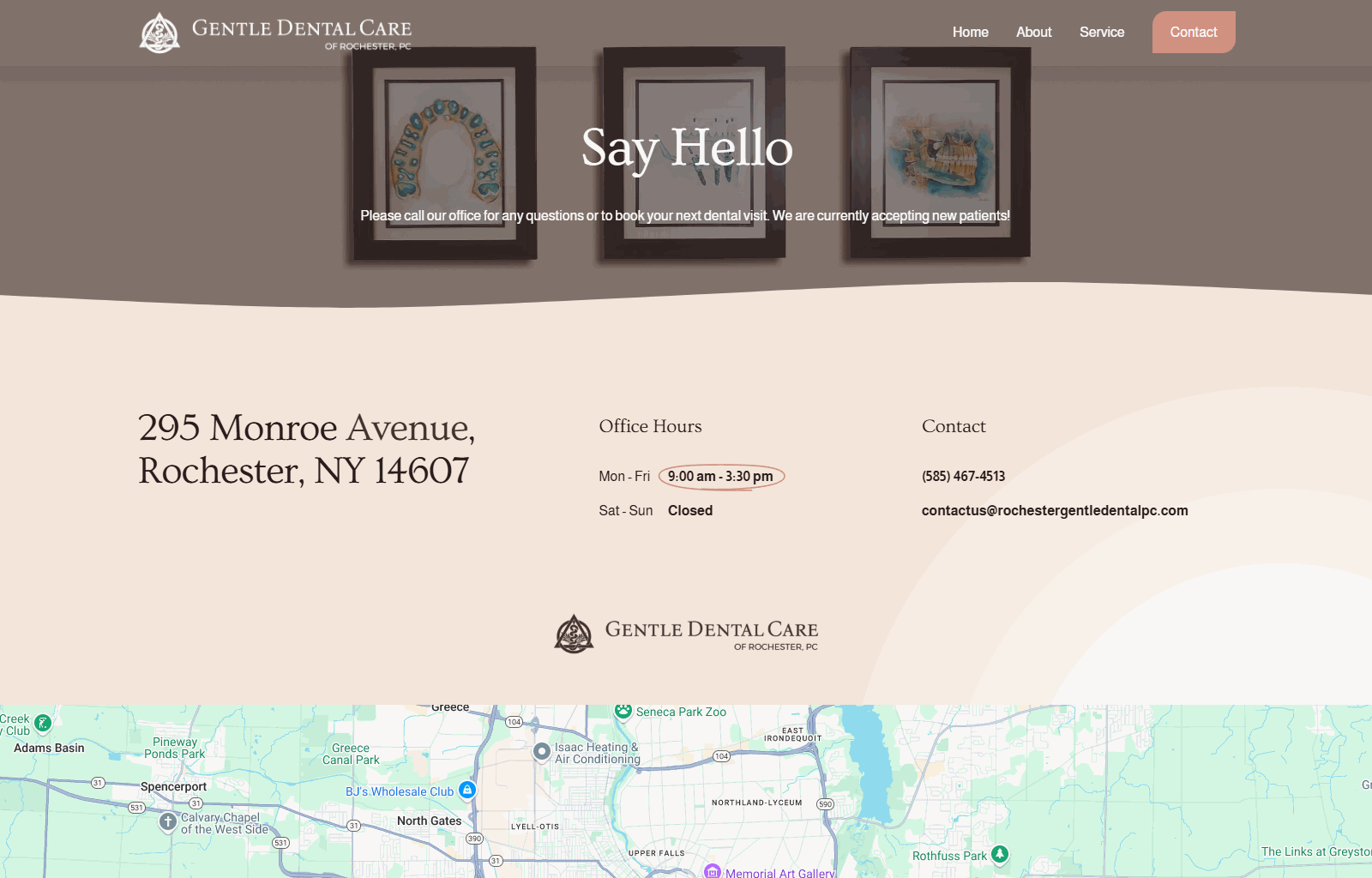
Contact:
The Contact page is focused on making it easy for users to take action—whether that’s calling, emailing, or visiting—by clearly presenting contact details, hours, and payment information.
Clear contact section: Address, hours, phone, email front and center.
Step-by-step appointment instructions: Easy instructions on how to prepare for a visit.
Payment info: Outlines accepted payment methods and insurance (CareCredit, credit cards, etc.).
FINAL PRODUCT
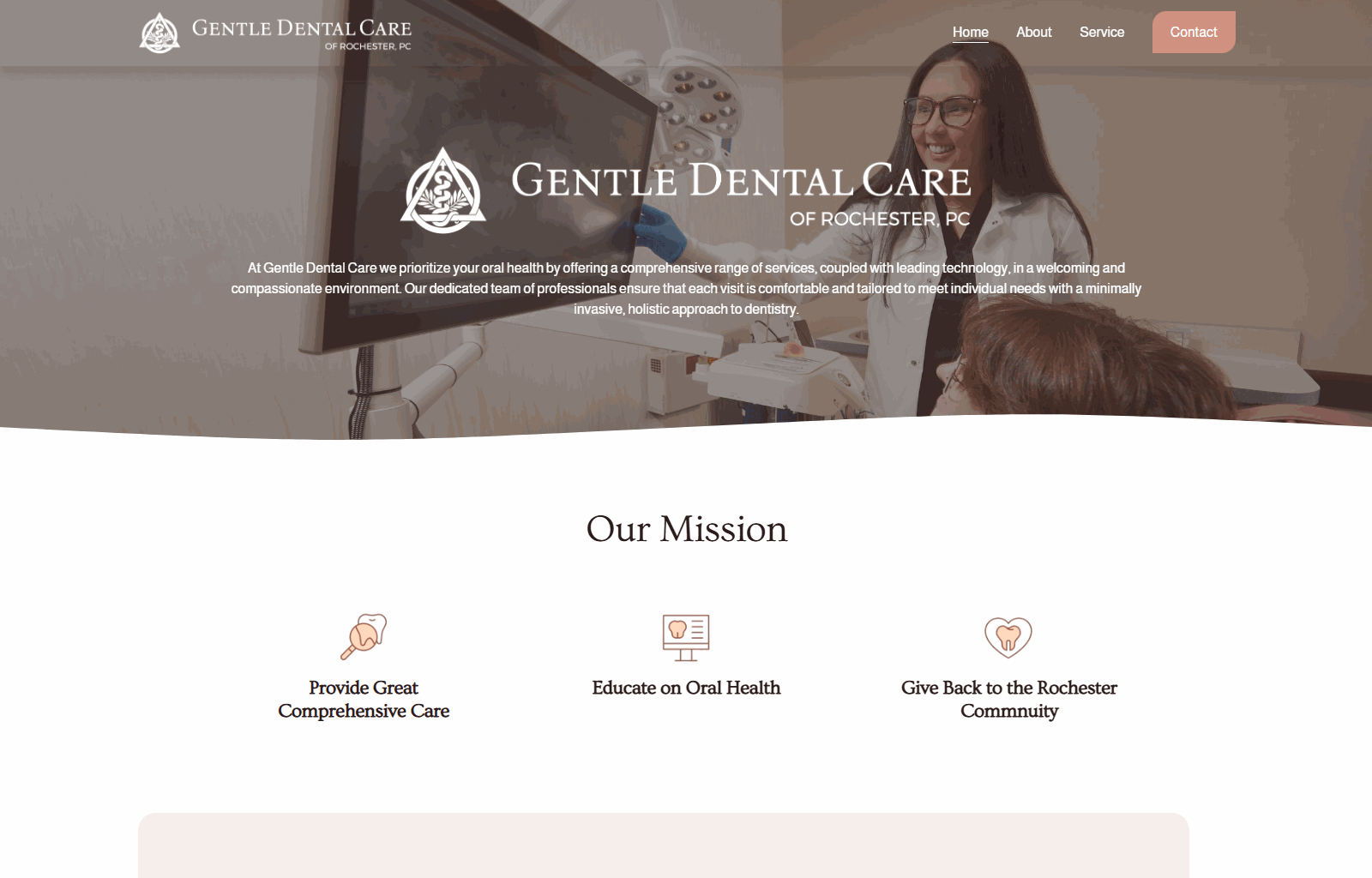
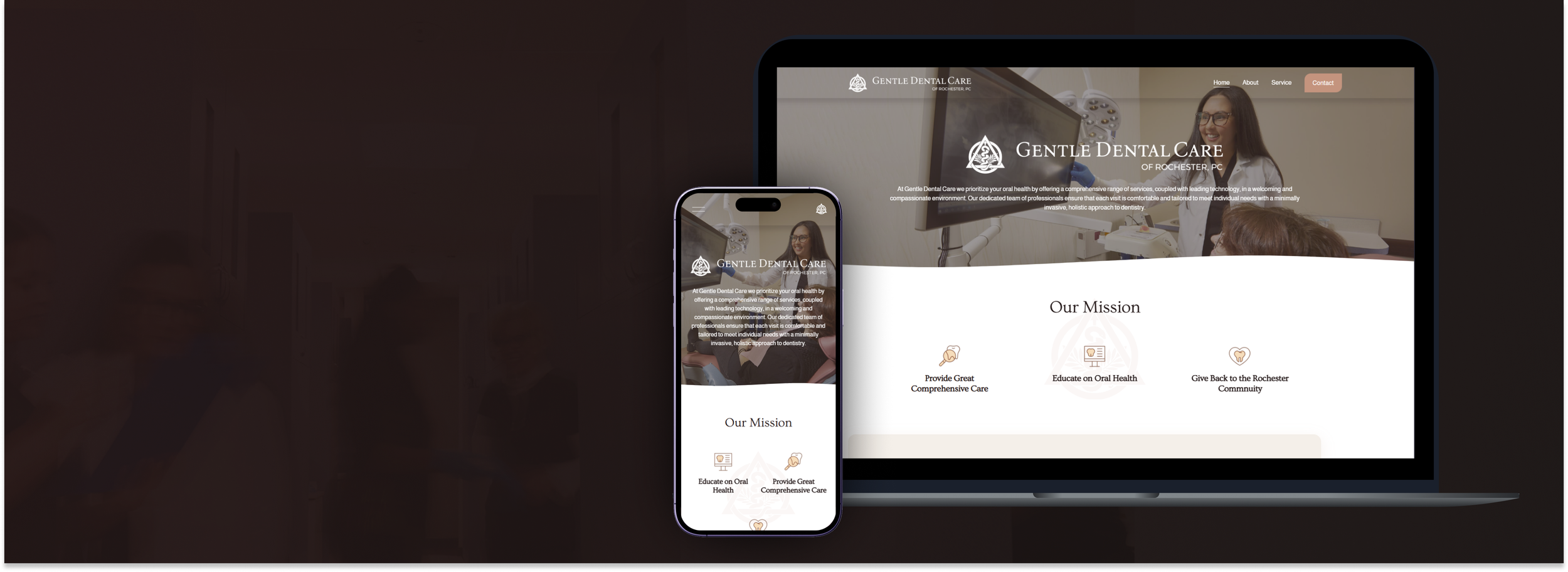
Main Page
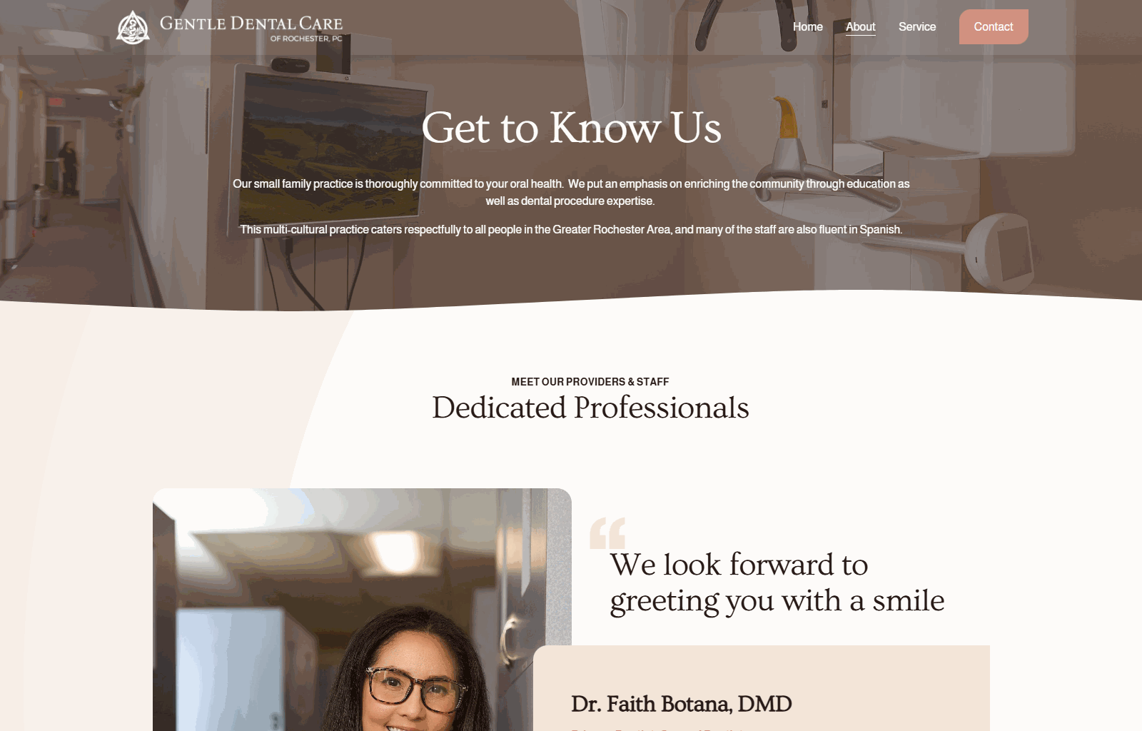
About Page
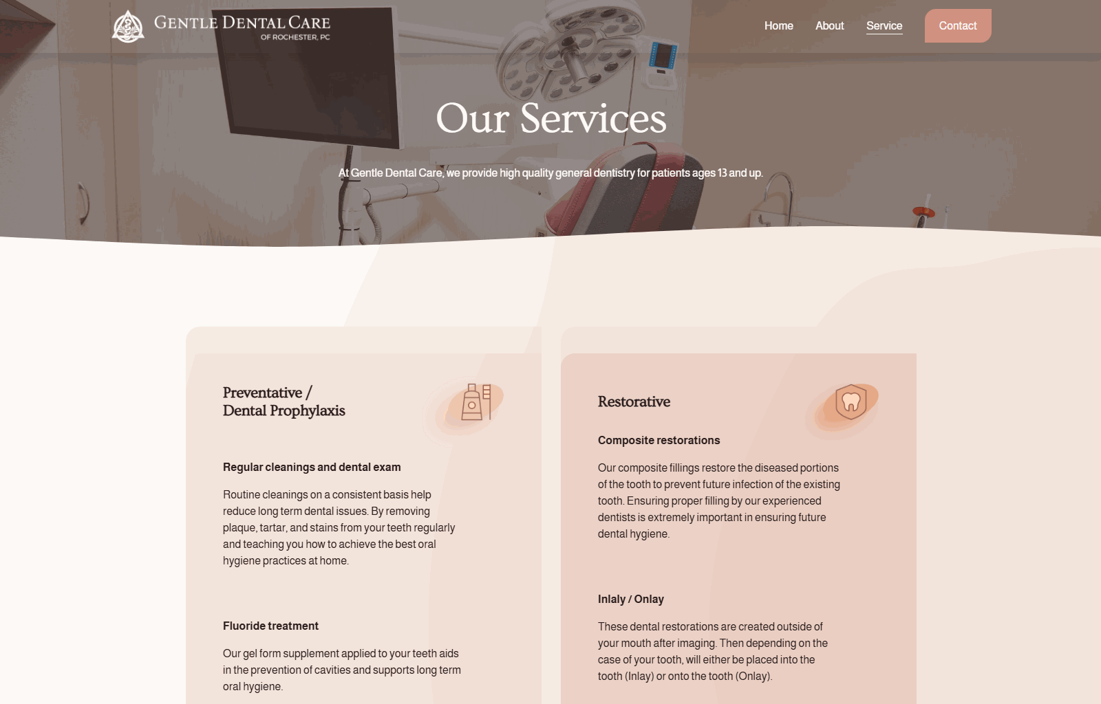
Service Page
Contact Page
The website redesign for Rochester Gentle Dental was completed and launched in Feb, 2025. I used a website builder as the foundation and customized it with HTML, CSS, and JavaScript to create a tailored theme that better reflects the brand and improves the user experience.
Key outcomes:
Simplified the information architecture for clearer navigation and quicker access to services
Designed a clean, calming visual identity aligned with the clinic’s brand tone
Created a responsive layout that performs well across desktop and mobile devices
Improved the appointment booking flow with clearer calls to action
Received positive feedback from the clinic for its user-friendliness and visual clarity