Deliberation Platform from Console to Front
Designed a civic participation platform that simplifies public deliberation through a step-by-step, user-friendly interface.
Improved accessibility and clarity for both citizens and facilitators across all phases—from learning to proposal submission.
Focused on streamlining complex processes while ensuring transparency, fairness, and user empowerment.
#Web #Responsive #Desktop #Figma #B2C #B2B #UIUX
Overview
Background
This project started with a clear need: citizens didn’t have enough direct channels to participate in public decision-making. Most deliberations were happening behind closed doors, and even when opinions were collected, people rarely saw real impact.
We wanted to change that.
The goal wasn’t just to create a space for discussions—but to build a structured, trustworthy system where citizens could actively propose, discuss, and vote on issues that affect society. We also wanted those discussions to lead somewhere—to influence laws, policies, or institutional changes in a traceable, public way. In short, this platform was about making public voices count.
My role
As the lead product designer, I was responsible for designing the entire experience—from structure and flow to visual design and interaction.
I mapped out a step-by-step user journey across six major phases:
Introduction → Learning → Discussion → Opinion Sharing → Consensus → Results.
Each step required specific tools—like file upload, surveys, Q&A, group meetings, and voting modules. I created a modular design system that supported those interactions, while also ensuring a consistent experience across desktop and mobile.
I also emphasized accessibility, transparency, and visual clarity—so that even first-time users could navigate the platform with confidence.
Goal
The main goal of this platform was to close the gap between ordinary citizens and the institutions that shape their lives. We didn’t want people to feel like passive observers—we wanted them to truly believe that their participation could lead to real, meaningful change.
To make that possible, the platform had to offer a process that felt approachable and easy to follow. Whether someone was participating as an individual or part of a group, whether they preferred to engage anonymously or publicly, the system needed to support those choices. It was also important that people could see where they were in the process at any given time—tracking progress transparently and feeling a sense of movement and impact.
Most importantly, the results of participation couldn’t just live in the system. They had to be exportable, reportable, and capable of being transformed into official proposals or feedback that could be shared with institutions. This wasn’t just a product—it was designed as a civic tool to turn voices into influence.
Implementation Highlights
OBJECTIVE
To create a digital platform that empowers citizens to actively participate in public decision-making — from proposing ideas to voting — in a structured, transparent, and traceable way. The platform aims to bridge the gap between the public and institutions by transforming civic input into real social, legal, or policy impact.
Research
CHALLENGE
Public deliberation in Korea and globally often suffers from low participation, lack of transparency, and little tangible outcome. Citizens may leave comments or attend town halls, but rarely see how their input changes anything. The problem is not just engagement — it's trust.
Moreover, designing for deliberation means addressing different personas (admins, facilitators, citizens, experts), different methods (surveys, meetings, Q&As, voting), and a wide range of contexts (local policy, government feedback, educational use). It had to be a highly flexible yet simple-to-use system.
| Platform | Country | Strengths | Weaknesses | UX Implications |
|---|---|---|---|---|
| Purpoz | France | Guided proposal and voting flow, clean UI, civic onboarding | Rigid structure for complex deliberation, low transparency in outcome delivery | Customizable workflows and clear traceability from idea to policy needed |
| Parti | South Korea | Emphasis on democratic process, strong framework for citizen organizing | Overly conceptual, lacks scalable admin features and polished interaction | Balance theory with usability; apply value-driven design through intuitive UX |
| People's Voice | South Korea | Official government platform with open idea submission | Poor UX/UI, unclear process stages, minimal feedback loop | Progressive disclosure, process visibility, and participation feedback needed |
Key findings
Users want clarity on what their role is at each stage
They expect feedback or acknowledgment after participation
Admins need modular tools (upload files, set up panels, run surveys)
Most users lack experience in digital participation, so the UX must guide without overwhelming
User flows & Wireframe
wireframe of Main features
In this case study, the primary UX design focus is on the Deliberation Management section (Pink container), as it represents the core interaction flow for both participants and administrators.
1. Organization Management
2. Deliberation Management
3. Panel Management
4. Survey Management
5. Data Management

about ‘Deliberation Managment’
I led the UX and interaction design of a 6-step deliberation workflow:
Introduction — set the topic, upload background files
Training Program— share educational materials and Q&A board
Discussion — create groups, manage schedules, set pre-surveys
Survey — allow users to submit and filter viewpoints
Consensus Building — enable structured voting or decision-making
Results — generate reports, export outcomes, and suggest policy drafts
In parallel, we designed an admin and planner console where organizers can:
Manage teams and roles
Upload or update resources
Monitor surveys and participation status
Track the entire timeline of deliberation events
Each feature was benchmarked from platforms like Purpoz and Parti, but improved with better accessibility (WCAG), mobile-first layout, and a modular UI structure.
2. Deliberation Management
Introduction
set the topic, upload background files
Training Program
share educational materials and Q&A board
Discussion
create groups, manage schedules, set pre-surveys
Survey
allow users to submit and filter viewpoints
Consensus Building
enable structured voting or decision-making
Results
generate reports, export outcomes, and suggest policy drafts

work flow

wireframe
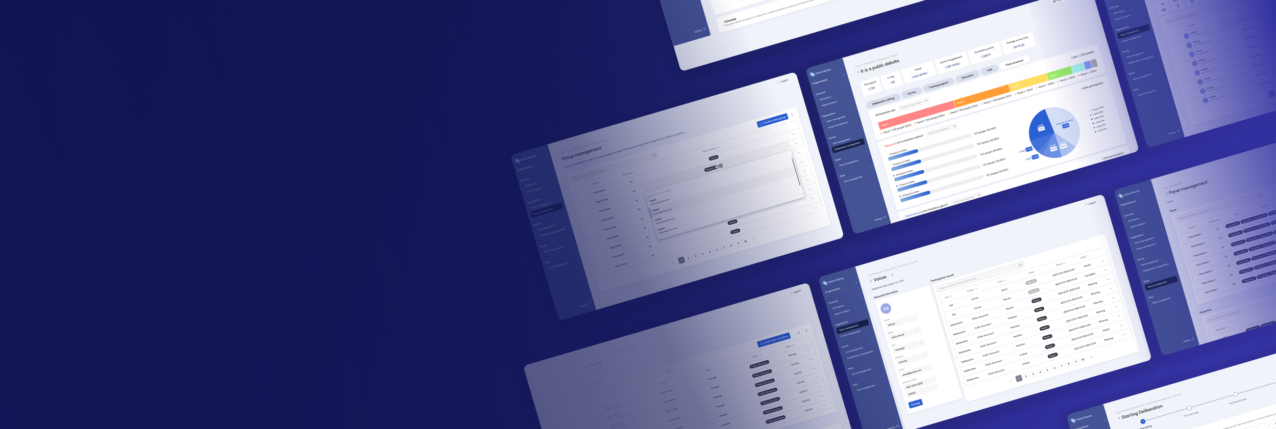
console interface
This is the console interface designed for administrators and planners.
Before presenting the detailed UI of the deliberation screens, I included select views from the console to help provide context and clarify the overall concept. These screens highlight the structure and tools available for managing the deliberation process—such as user roles, schedules, and content flow.
1. Organization Management
2. Deliberation Management
3. Panel Management
4. Survey Management
5. Data Management

2. Deliberation Management

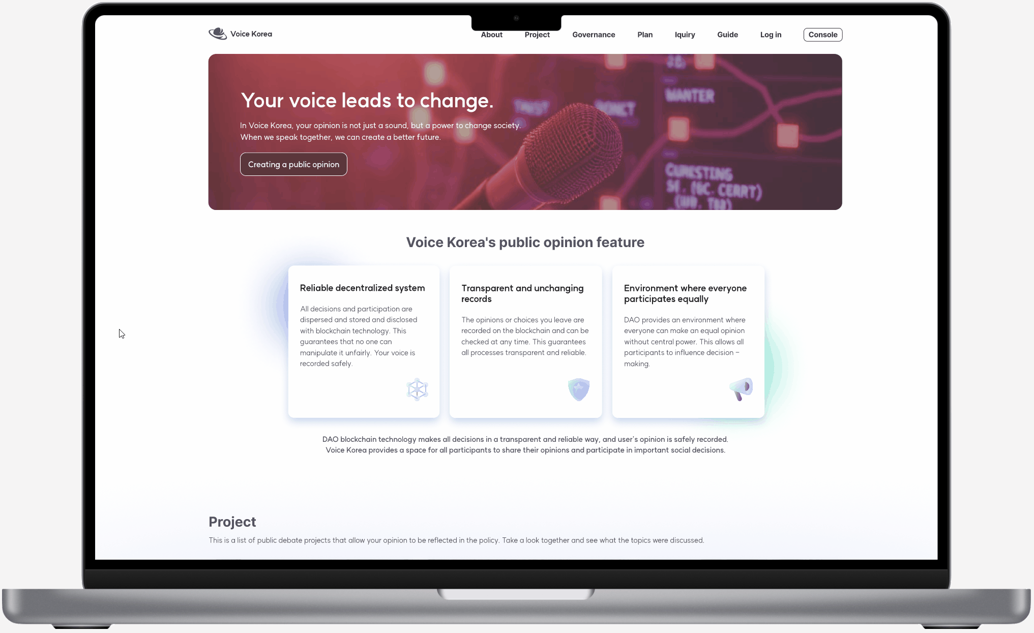
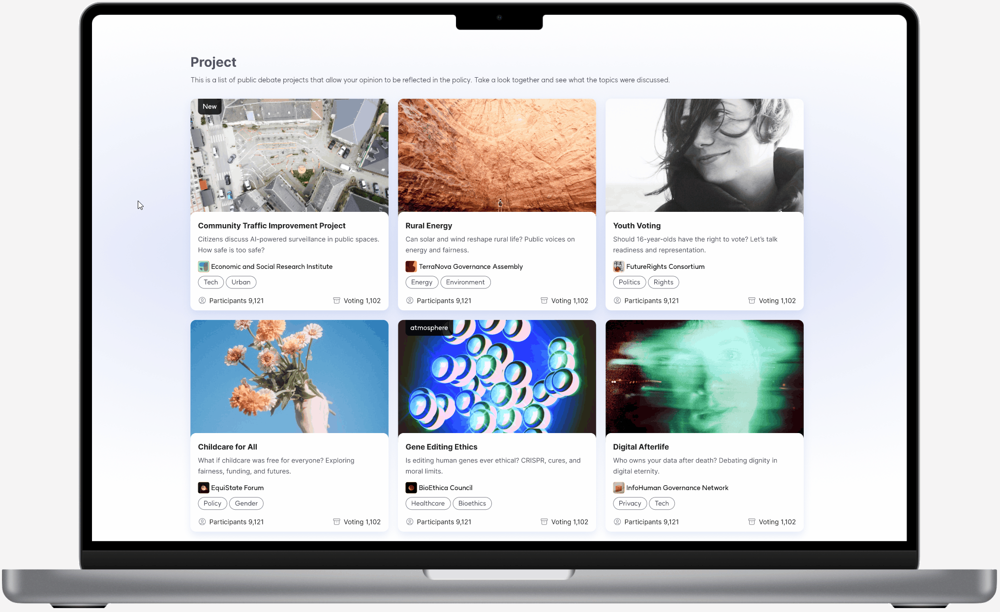
Front-Facing interface
This is the front-facing interface designed specifically for participant users.
Any deliberation created through the admin console appears here in a user-friendly, accessible format. From the main landing page, users can browse ongoing or past projects. By selecting a project, they’re guided into the corresponding deliberation flow where they can actively participate.
main platform
deliberation
KEY LEARNINGS


Designing a civic participation platform wasn't just about creating screens — it was about building trust in a system that has long felt distant or ineffective to everyday citizens.
Through user interviews, stakeholder workshops, and platform benchmarking, I realized that people don’t disengage because they’re apathetic — they disengage because the system is too complex, unresponsive, or opaque. The solution, then, wasn’t just a better interface. It was a better experience of being heard.
One of the most impactful insights came from observing the emotional gap between participation and outcome. Many citizens had submitted proposals or filled out surveys in other platforms, only to feel like their input disappeared into a void. This shaped one of our strongest UX principles:
Every user action must have a visible reaction.
This led to design features like:
Progress indicators to show where you are in the deliberation
Acknowledgment messages after every contribution
A visible timeline of how feedback moves toward real outcomes
Another critical learning was that admins and facilitators are users too. Many platforms we studied, including Purpoz and People’s voice, neglected the internal tooling side. By prioritizing the admin console experience, we empowered planners to create and manage complex deliberation structures with minimal friction — which in turn improved the experience for citizens on the front-facing interface.
From a systems design perspective, I learned that public processes must balance structure with flexibility. We had to design for diverse methods — from Q&As to live discussions to policy drafting — and support both anonymous input and group discussions. This required a modular UX architecture that could scale across many use cases without overwhelming users.
Ultimately, this project deepened my belief that UX design is not just functional — it’s ethical.
When we make participation easier, more transparent, and more meaningful, we’re not just improving usability.
We’re strengthening democracy by design.